Hospitals are now enlisting more and more professional designers to develop their signage. Graphic designer Ruedi Baur stresses the importance of an efficient wayfinding system to improve patients’ well-being.
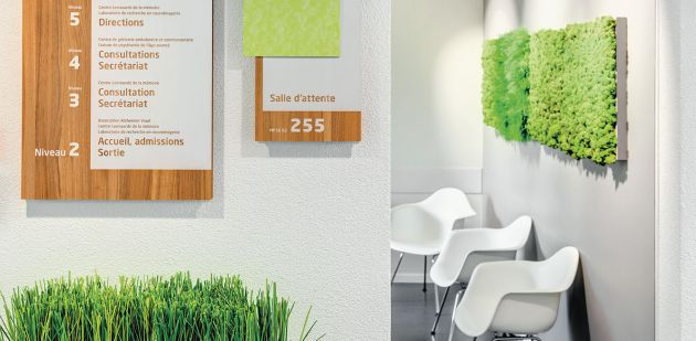
Prioritising information, directing visitors clearly and simply and preventing additional stress. These are the challenges of creating successful signage systems. And when they are transposed into a hospital context, the challenge is even more difficult. “Hospital signs are some of the most difficult to design,” says Laurence Guichard, director of the Paris-based design agency Locomotion, which recently participated in the construction of a new hospital in Marne-La-Vallée, just east of the capital.
Stifled by their esoteric terminology and endless corridors, hospitals are now beginning to entrust their signage systems to design professionals, borrowing from the formulas used in airports and supermarkets.
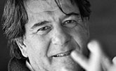
To learn more about it, In Vivo met with Ruedi Baur, the master of modern signage, on his way back from Tehran and passing through Geneva where he teaches at the Geneva University of Art and Design (HEAD). For him, wayfinding begins with the invitation to come to a medical appointment, and the path within the hospital is just an extension of the path in a city. Like in a city, the combination of meticulous signing and the specific charm of each neighbourhood is what helps everyone to find their way.
IV What do you think is successful signage?
RUEDI BAUR We live in a world of increasing complexity. Infrastructure is more and more vast, and the movement towards conglomeration keeps growing. Human beings are confronted with huge architectural blocks that are often unintelligible. A successful signage system is one that is aware of that complexity. I’m first and foremost an activist, aiming to make our society more understandable. That is essential for a democracy to function properly and for people to feel comfortable. The intelligibility that needs to be developed is not just about visuals or graphic design. It’s mainly about understanding systems and space.
In a complicated world, our first reflex is often to suggest bigger, brighter signs with more imposing typefaces. Then there is the widespread culture of “branding”. Every structure has its own logo. They each develop their own way of expressing themselves without any thought for the environment in which these signs will live, without working on that relationship. And it obviously doesn’t work well. With a research team, we are currently analysing information related to the University of Strasbourg. As in many other situations, we have noted that each activity is viewed in relation to others. At best, we can understand the institutions but not the subject developed. Then there’s the culture of acronyms, which makes everything unapproachable for non-specialists. We found thousands of acronyms used at the university! I remember the first thing I noticed when I first visited Lausanne University Hospital, “It’s not that there aren’t enough signs, the problem is that there are too many.”
IV To make something understandable, must we be able to simplify it?
RB The solution of standardising everything is not the right way either. People get lost when everything looks the same. The telephone book is definitely practical, but it’s not where you’d want to move about. We have to find a third way. We need to work on the atmosphere in different areas and contribute to the well-being of the body in movement. The point is not just to direct patients. We also want to make sure they feel comfortable. I think that we don’t just find our way around by using data but also through atmosphere, lighting, materials and colours. We find our way by using things that make sense to us, like in a city. In a city, we spot the cathedral and figure out where we are in relation to that. It’s obviously harder to do that on an obstructed hospital floor, where nothing can be named. But that’s where the challenge lies.
I’d even dare say that the sign is actually just like a spare tyre. Ideally, I should be able to get around in a place with references of understanding. The need for signs should only be secondary. This is even more important in a time of life when the stress factor is high for me or a loved one.
"People get lost when everything looks the same."
IV So signage can contribute to reducing stress?
RB That’s the whole issue of spatial intelligibility. If you have to read everything and everything looks the same, it’s a huge effort for the user to read every piece of information. Getting disoriented comes from the fear of getting lost. I’ve studied a lot about Chinese culture, which lived 3,000 years without arrows for people to find their way around. In the West, we can’t get by without arrows. In traditional China, where the compass was invented, orientation integrated architecture. A ritual of codes was used to distinguish between types of buildings, their use and the hierarchy of occupants. These identifying factors were reflected in the colour of stones, the shape of the roof, entrances determined by the cardinal points, etc.
IV What are your other projects?
RB One of my passions is reintroducing a “useful/useless” component into public space, with installations that are more poetic than they are there to guide us. Signs that don’t want to sell us anything or dictate our behaviour. I’m currently exploring a project in Mons – the European capital of culture – with 10 km of poetic writings that stretch over both public spaces and through private properties. Today, I think it’s essential to bring out the wealth of things and not just remain focused on their functionality. ⁄
Biography
Ruedi Baur is one of the big names in graphic design and signage. The internationally renowned French-Swiss designer has worked on major projects such as the Vienna airport and the future Greater Paris metro. For nearly two years, he and his team worked on rethinking how Lausanne University Hospital could improve its signage by making information signs more readable and by better prioritising information. Ruedi Baur believes it is essential to give meaning to signs, by thinking about the atmosphere and identifying factors that make it easier to find one’s way.


